现代的网络变化如此之快,它正变得越来越难以达到用户。过时的策略不再是工作,而新的策略才刚刚出现。它并不总是清楚什么是对你和你的工作。有时你觉得很好的想法可能会变成一个有趣的,混乱的,甚至是无用的。
几年前,一个精心设计的界面可以保证一个积极的用户体验,但随着移动设备的广泛分布,事情发生了根本性的变化。designcontest最近分析了形势,在UX世界和对未来的一些预测。
但在我传给我们,让我们定义的UI和UX的条款,因为很多用户甚至一些新手设计师认为,UI和UX是相同的。然而,这些概念之间的差异是非常重要的:
让我们想象一个年轻人去酒吧或夜总会,遇见一个美丽的女孩。也就是说,她是完美的界面(用户界面)。然后他冒了险,决定和她认识。但是,在交换了几句话,他发现这个女孩是一个太高亢的声音极其愚蠢的人。那是,他得到了负面的用户体验(UX)。
无论多么时尚和美丽的网站是,如果它是不舒服,不与用户交互,它不花一分钱。设计师、营销人员和网络开发人员应该考虑的第一件事就是正确的用户体验。
所以,让我们转到UX设计你在申请2016来得到想要的结果的趋势。
#1 Full-Screen Images
Recent studies have proven that a full-screen image makes the user stay a little bit longer on the website. That is, full-screen images attract attention and increase conversion.

In 2016, background images and pictures of happy people laughing are in trend. Another interesting effect is cinemagraph – an image with some elements periodically move.
#2 Monochrome Design with a Contrast CTA
One of the most exciting color trends in 2016 is the use of several shades of one color in the design of webpages with a contrast CTA as a prerequisite.

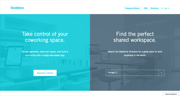
#3 Split Screen
If you unite multiple products or services for different categories of the target audience in the same advertising campaign, one of the best tricks you can do is to use a split screen to quickly and easily send a specific user to the desired proposal.
#4 The Simpler – the Better
Please remove all unnecessary and excessive from the website and leave only the elements you really need and those which can increase the number of potential customers, namely powerful and well-thought header, simple and revealing the essence of the proposal subtitle, and the capture form.

Additional options and features on the website have chances to increase the conversion rate only if all proposed actions are accessible and as simple as possible. Therefore, you need to take care of simple and easy navigation: the user must immediately find what he needs and get where he needs.

#5 Convenient Location of Buttons
The CTA button should always be at hand and in sight. Attach it to the footer or sidebar. Believe me, it’s paramount.

No matter how many blocks are on the website – the title, the subtitle, and the form of capture with a call to action should be within the same block.
#6 Attention to the Audience
Personalize your users and pay attention to them. How to do it? Track their latest actions and, basing on the collected data, provide them with the right information at the right time. Personalization greatly increases the likelihood of a purchase.

#7 Card Design
Pinterest style has inspired designers and become an important trend in UX. Such a structure is useful, interesting, not obtrusive, and, most importantly, effective since it makes even the most suspicious users to stay longer on the website.

#8 Video
According to experts, videos will be one of the most effective UX tools in future since it increases the trust and credibility of the brand in users’ eyes. Just tell your audience what it wants to hear in the most interesting form.

The term “UX” was proposed by Donald Norman, who studied the cognitive aspects of user behavior and substantiated the need for user-centered design, which involves the easy and pleasant interaction of users with interfaces.
Although UX involves the use of technologies, it’s much more than just a technological matter. UX is how we live and how we use devices with interfaces. Moreover, UX is not limited by a computer or mobile screen since the device with no screen may have UX. That is, modern UX is any interaction with a product/system.